The Challenge
The TINYpulse brand was rapidly changing in 2016. Launching the new 3.0 of our product (web and mobile app) meant it was time for a rebranding of our website. We needed a refresh on our visual direction from the dated 2012.
The objectives
Having a big green light to explore our creativity, we only have one condition, we had to launch the new website in 14 days before our biggest company event, TINYcon 2016. The basic requirements were:
- Aspirational tone and language
- Focus on user emotions (creating an emphaty map)
- Short and concise content
- CTAs – Users should be able to quickly navigate to relevant pages
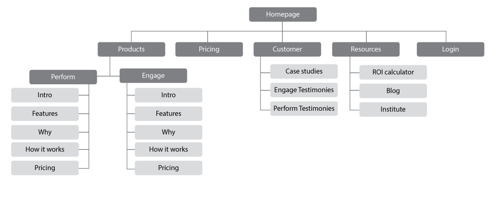
Information Architecture:
We built a squad of different disciplines from different teams: marketing, product, design and development. First step was holding a working session to brainstorm ideas and plan our execution.

Ideas:
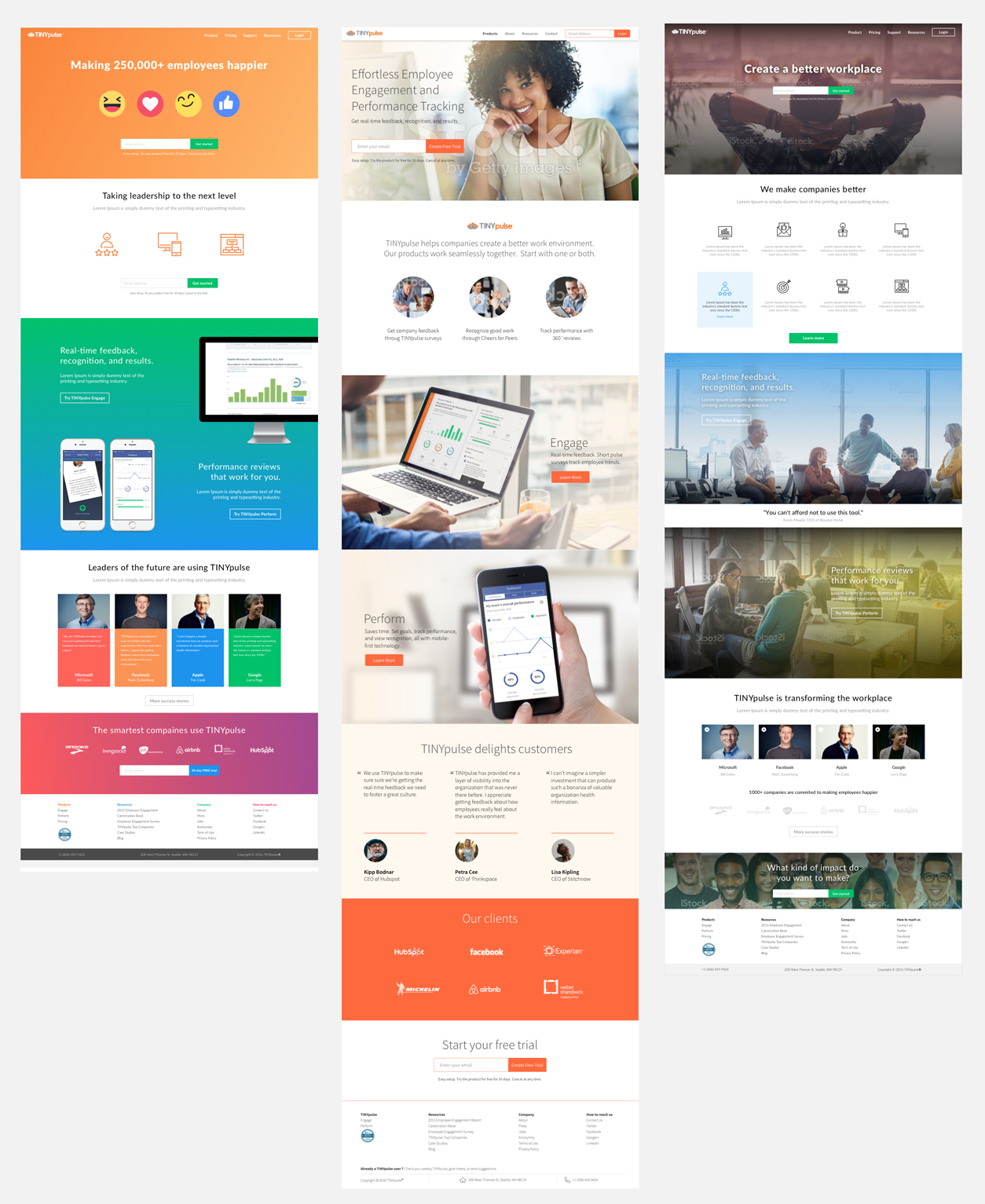
The team created what the TINYpulse brand should represent and overall look and feel of the website. To ensure every voice was heard, we went away and got busy with our first individual mocks. Here’s what we came up with:

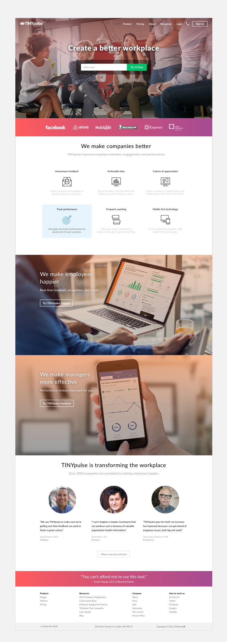
After some back and forth decision with leadership we finally locked on:
- Above-the-folder: hero image showing a team, a short headline that grabs attention, clear call-to-action
- Products: show our product in use, highlight the benefits
- Testimonials: show 3 short quotes – no videos
- Include: bright colours with gradients, brands we work with use under the hero-image as that increased conversion/click-through from previous test and aspirational quotes to strengthen brand image
The result
Now we had the direction finalised the team worked hard to repurpose all the other pages.

