Guardian Early Learning Group operates high quality Child Care and Early Learning Centres all over Australia. Guardian Care is Parent portal to monitor their child at the day care center for the child’s daily routine and development.
User Research:
Market research was conducted by external company and their strategies and roadmap was clear enough to start the process of UX design. Also marketing team support us with the target user groups and we started the research with contextual inquiry and Surveys. The day care centers spanned across multiple geographical locations and we visited few centers and approached other through surveys and interviews.
Our team interviewed around 35 people from 4–5 Childcare centres, also we did some surveys to verify our assumptions right.
Ideation:
The problem statement was clear, we had to concentrate on designing a all -in one portal app which a parent use to monitor their young ones in the day care centre. The differentiating factor was that it was an all round monitoring and customizable app to suit the nature and operational environment of each day care center.
The contextual inquiry highlights were:

The Challenge:
It can be an ordinary day care monitoring system where day care centres cannot customize or configure according to their needs and end up juggling between multiple software applications to depict the child development.
How to Solve?
- Design 1 view child care center monitoring system with rich set of features spanning the services which a child care center parent utilize.
- Design real time and historical data views about the child
- The application has to be walk on the go and ensure round the clock monitoring through mobile first mode.
- The application has to be a responsive and interactive system which can keep the child care users up to date and connected.
Target
Our main target user groups were child care center users.
- Parents: who drop the kids.
- Trainers: who take care of kids and
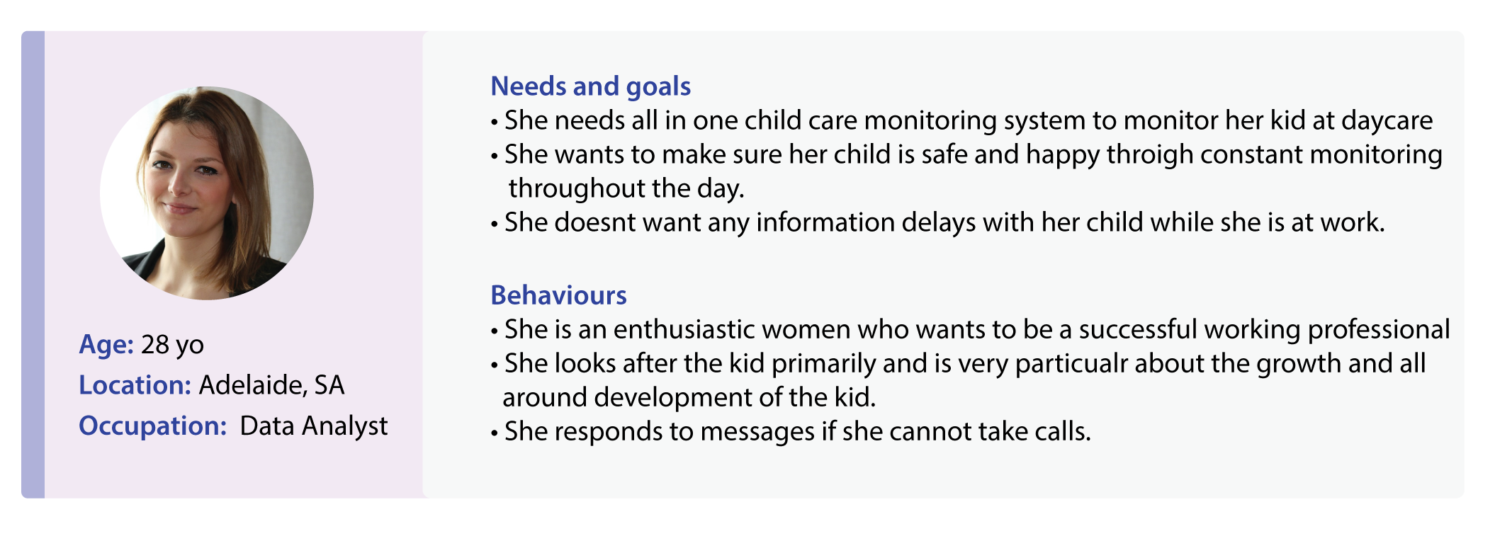
- Stakeholders/ management of childcare centers.We created 4 personas representing target User groups and here’s one of our example persona:

Job Stories:
- When I am at work, As a Parent, I want to view the real time video surveillance of my kid, to be assured of safe environment throughout the day.
- When I am at work, I want to communicate to my child’s teacher instantly about the nature of food to be given without having to wait to reach her through calls.
- When my kid is at the day care center, I want to monitor multiple times in a day w.r.t to the food, activities and the daily routine without disturbing the teachers.
- During my kid’s tenure at day care center, I want to analyze his/her sleeping and eating pattern to better handle the growth spurts and development mechanisms.
Information Architecture:

Wireframes
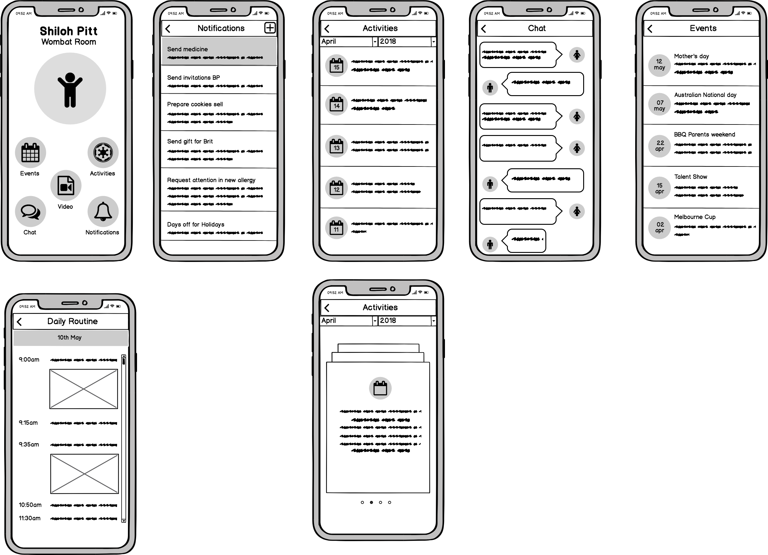
We created rough wireframes before getting started. Keeping in mind about the rich set of features, we did not want users to view this as a complicated app in terms of navigation . With an early testing we validated sketches with same set of users whom we interviewed with during contextual interviews.

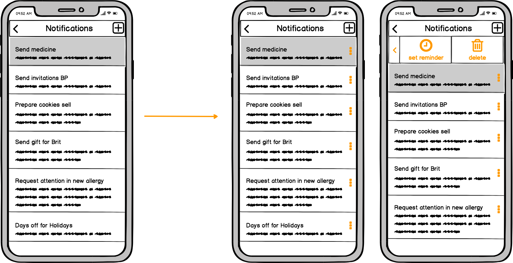
Based on collected feedback, we redesigned some features and screens.
Pain Point 1:
7/10 users needed a date and time reminder to be set for notification updates which are actionable .So that screen was revamped.

Pain Point 2 :
6/10 users needed daily Curriculum updates screen a way to ask or pose a question to the teacher.

Final Steps:
For a visa situation I couldn’t finished the rest of the project. I had to handed the final steps to the team. I was satisfied about the learning curve this project gave me.
