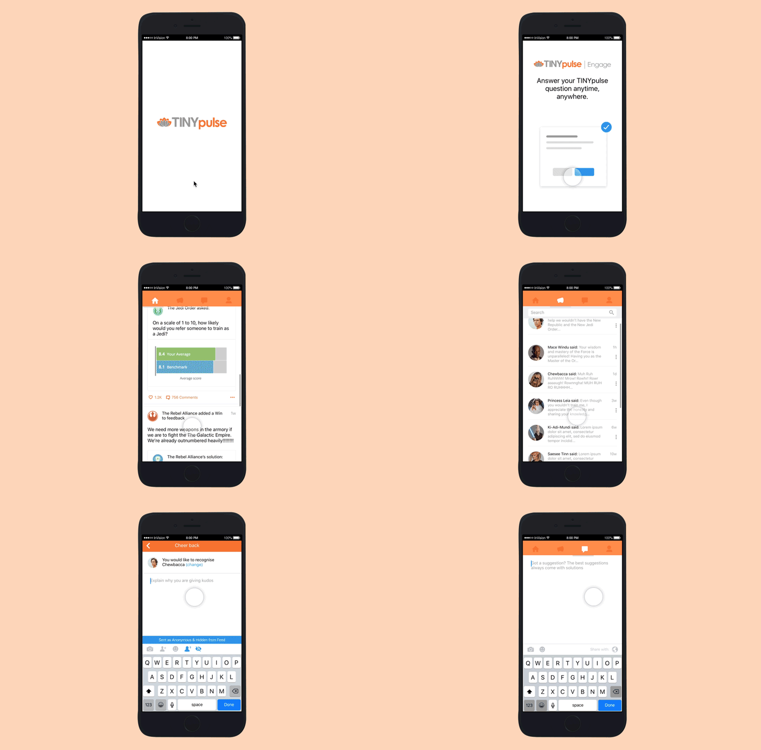
Overview
Tinypulse is a company that created a software tools for businesses that treasure their most valued resource — their people. Through Engage and Perform products Tinypulse helps to businesses to reduce turnover, improve communication, and build a world-class culture.
Their Engage sends a quick, one-question pulse to employees each week. Employees can respond using their desktop or on their iOS or Android device. All pulsing survey responses are 100% anonymous, so employees feel comfortable giving completely honest feedback.
Objectives
- To improve employee engagement by 20%.
- Branding team decided to unify Tinypulse brand products to improve brand awareness and drive lead generation.
User Persona
Samantha M. is the new Operational Manager of Delta Group and is an explorer and strategist. Samantha lives and breathes growth for their clients through inspired leadership, brand, and culture programs. She has led many successful game-changing programs of work across the private and public sectors. Samantha brings a unique vision to the table, and for over 25 years.
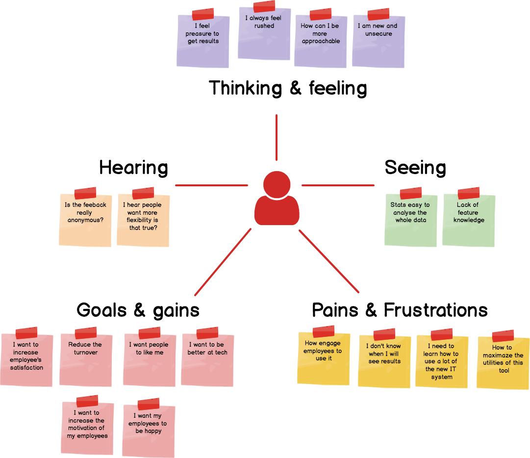
Empathy Map
Our empathy map helped us to establish common ground among our design team and to understand and prioritize user needs. Using a 30 minutes interview with one of our current users, plus additional information from sales team.
Insight Identification
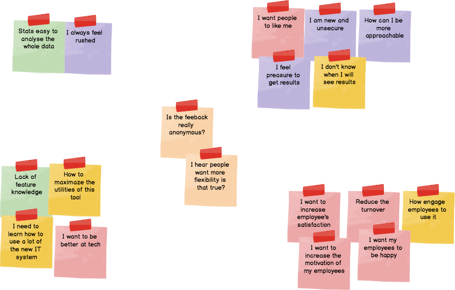
Taking our persona, the team moves through the stickies on the board collaboratively and clusters similar notes that are related. Through this activity of clustering facilitates discussion and alignment. After the clustering our goals arrived at a shared understanding of your user by all team members.
- I need a simple tool to understand my employees.
- I want my employees to use the tool so I can understand them.
Ideas Prioritization
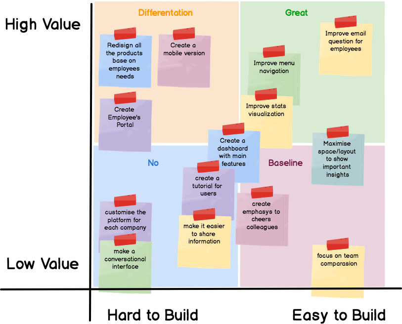
After analyze the insights of our persona, we created features and possible solutions to cover the objectives and satisfy the demand of our user persona. Subsequently Development team, Design Team and Product owner took in consideration all the variables to define what was the most viable tasks to start. Using different colored dots to each team member, we voted based on criteria that fall with each domain of expertise.
With that we concluded that we start with the Great quadrant:
- Fixing email
- Fixing navigation menu
- Improving visualization of stats
- Creating a new dashboard
- Improving layout distribution
Followed by the Differentiation quadrant where this case study is focused:
- Creating a mobile version
- Creating employee portal
Initial Prototype
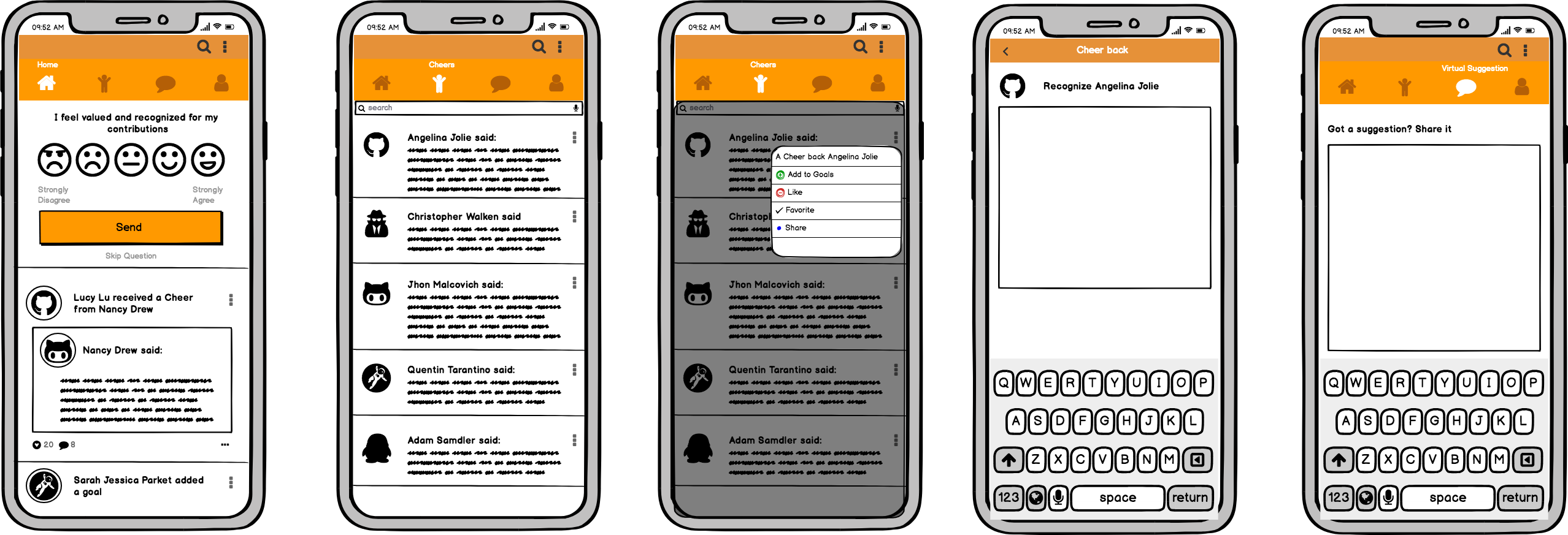
We combined a series of ideas to provide 2 different prototypes to be tested. Focusing on the creation on an Employee Portal – mobile version. Let’s remember that the features in “Great” where done before this prototype as they are quick wins.
- Wireframe Version A

- Wireframe Version B
Early Testing
Using our previous prototypes, we did A/B testing on the wireframes. We offered to few of our colleague the option to choose between the 2 variants, we analyzed their time used between prototypes and their individual approach. This process help us to avoid the risk of putting together a complete prototype and realizing far too late that there is a flaw in the design that should have been dealt with in the early development stages.
The conclusion of our test made us realized that the version A with a pop-up style question leads to a fast not meditated answer. Meanwhile version B with a feed section where the employee see the one-question pulse, cheers shared by other colleagues and other stories, created a better response and users where more interested on review the feeds.
Final Product
